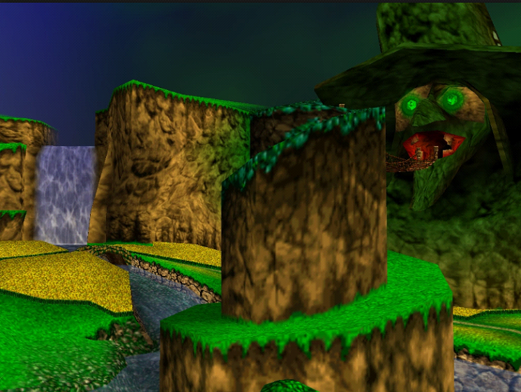
One of the things that makes Banjo-Kazooie a great game — even by today’s standards — is its timeless level design. Every wall, every collectable and even most of the window-dressing was placed precisely as the designer intended. They did this in order to both guide the player and to cater to audiences of differing skill levels. When I was playing through the game again, a number of these clever decisions stood out to me as being particularly important to the player’s enjoyment throughout the game.
Grunty’s Lair: Entrance
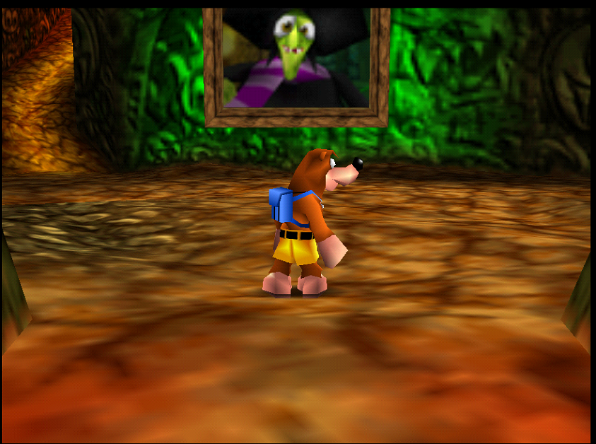
When the player first enters the foyer of Grunty’s lair, their attention is immediately grabbed by a large painting hanging on the wall in front of them. This guides the players eyes directly forwards. As seen in the below image, the only other notable feature near the painting is a winding path heading upwards into the lair. Unfortunately for the player, however, this path proves too steep for our heroic duo and Banjo quickly slides back down to the bottom, regardless of whichever combinations of jumps, rolls and attacks the player may try.
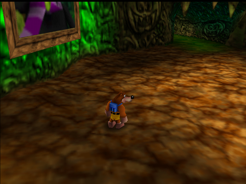
Should our hero not lose hope after this crushing defeat, they will likely turn around and notice a second, less obvious tunnel to the right of the portrait; one which leads to a room with both a closed door and what appears to be a jigsaw puzzle on the wall. Upon inspection, Bottles the Mole will inform the player that they require a jigsaw piece in order to progress. As there is nothing more to find in the room, our hero will head back the way they came
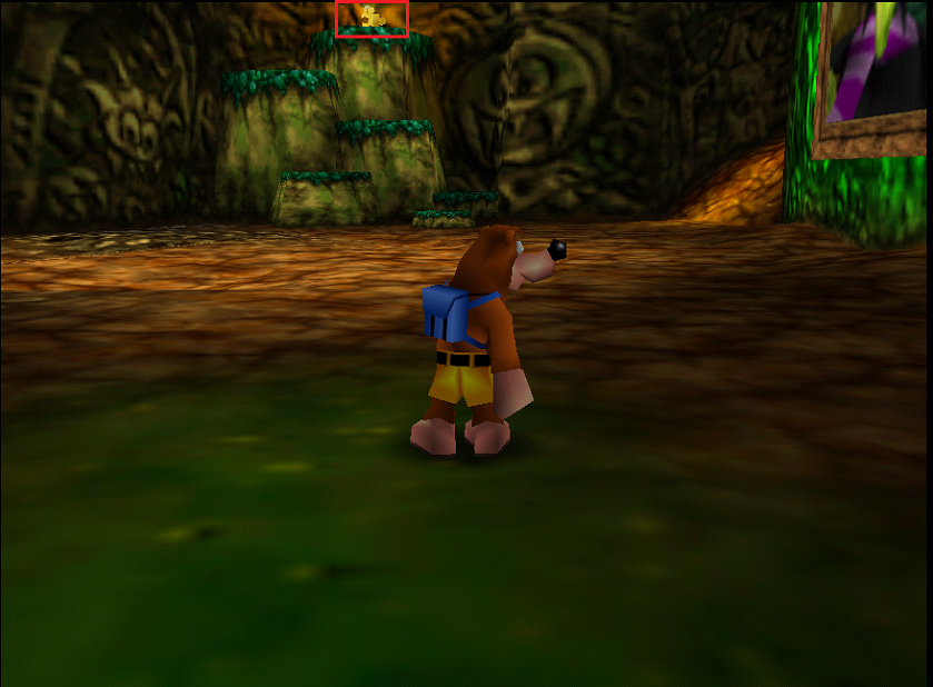
During the trudge back to the foyer entrance, the low ceiling of the tunnel forces the camera to a much lower angle. Because of this when again emerging from the tunnel you will notice something new: a puzzle piece lying in plain sight! It was no coincidence that a tunnel rather than a corridor was used here, the designers wanted to teach the player to observe their surroundings more carefully while encouraging walking around to find new information. More experienced players know where it is hiding already and can bypass this exercise while getting a small amount of satisfaction from doing so. On its own this example may seem insignificant, but the game is filled with hundreds of these seemingly small design choices which add up to create a much better experience for the player.
You could argue that the game could simply provide the player with the Jiggy straight away. Why not just place it under the painting? Then you wouldn’t need to waste so much time wandering around. My answer to this is that wandering around and exploring your environment is the primary focus of the game and removing it and similar moments would detract from what the game is trying to achieve. This short process provides the player with a few key experiences which tie into the game’s central themes of discovery and exploration.
To begin with, failing to traverse the slope acts as minor foreshadowing. It informs the player that there is something they are missing which they will need in order to progress. Along with the puzzle wall, this helps to teach the player that the best way to solve their problems is to explore their surroundings, something that they will no doubt run into time and time again on their adventure. When they finally get the ability to climb steep inclines via the Talon Trot ability, the player will experience a kind of ‘light-bulb’ moment as they realise that more of the Lair is now open to them.
In fact, throughout the game you are presented with both obstacles and power-ups a few levels before you can use them to instil a sense of anticipation upon the player. They make you wonder what they are for, how can you use them and just how many techniques are there in this game? It isn’t just the obstacles that evoke this reaction either. The jigsaw puzzles let you glimpse into the future by showing you the level you are about to explore and it is that sense of wonder, exploration and discovery that the designers of this game have so carefully woven into the experience with even the most minor details.
Orientation through design
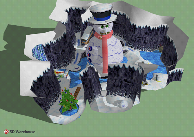
Banjo-Kazooie’s levels aren’t particularly large, however their density and maze-like qualities could have been very confusing for its younger target audience if it weren’t for a couple of clever design elements. While each level is somewhat varied in size and shape, something common to all of them is the presence of large and visually distinct landmarks visible from almost anywhere in the level. A great example of this is Freezeezy Peak, which features a massive snowman right in the centre of the level. It’s absolutely huge and there is no way the player could miss it. What’s more is that both the massive scarf and the snowman’s face is pointing directly at the entrance to the level. As such no matter where you are you know how to get back and it is very easy to mentally map the level around this point of reference.
Each level follows this principle to some degree with the majority of them implementing a doughnut shaped level structure with the landmark in the centre. Click clock wood has a huge tree in the middle, Mad Monster Mansion has the titular mansion near the entrance and Clanker’s Cavern contains a massive metal shark facing the way out. Even the tutorial effectively guides the player to Gruntilda’s Lair with it’s layout. Where in the world could that nasty witch be hiding? Look no further than the massive witches face sculpted into the side of the mountain! Not only do these landmarks orient the player but they look great too!
Size matters
Something that I took for granted when I was younger is the fact that all of the interior locations in the game are much larger inside than their outwards appearance suggests.
Take for example Clanker, the large metallic shark in Clanker’s Cavern, who is many times smaller than the numerous rooms that exist inside of him. His mouth and stomach together would take up more space than his entire outer body! And that’s not even counting another few rooms on top of that. Were his exterior large enough to realistically contain all of these hidden rooms, the entire level would need to be much larger. The result of this would be a hindrance on the player’s ability to quickly traverse the level, which in my opinion is one of Banjo-Kazooie’s greatest strengths.
This design choice is repeated throughout the game such as in Mad-Monster Mansion’s titular building and it’s nearby church or in Gobi Desert’s pyramids. Here the designers have taken the best of both worlds: suitably spacious interiors for a variety of challenges and small exteriors which don’t take up too much space and help to keep level size to a minimum.
Banjo-Kazooie is ultimately a game about whimsical exploration, running around almost aimlessly and taking in the sights. The creators of this game knew this very well and have managed to capture those feelings through use of some very clever design elements. They may not all be apparent at first, but they all work together to bring this joyous experience to life.

